Platforms know everything about their viewers. The interface acts like they know nothing. Two years of viewing data per profile. Session lengths, drop-off points, search behavior, device preferences, time-of-day patterns. Most streaming platforms offer a richer picture of each viewer than almost any other consumer product can. And then they render the same interface for all of them. Same rows, same layout, same defaults, same order. The profile is detailed. The screen it produces is generic.
That is not a data problem. It is a design philosophy problem. The platform was built to feed a recommendation engine, not to reshape the interface around the person in front of it. Until that changes at the architecture level, no amount of data will close the gap between the experience the platform could deliver and the one it does.
Personalizing the recommendation rail while the rest of the interface stays fixed is not personalization for streaming services. It is segmentation with a nicer thumbnail.
Segmentation has a ceiling, and you can see it
Segmentation sorts people into buckets and serves each bucket a template. A kids’ profile, an adult profile, a new-releases shelf for everyone. It is better than nothing, and it stops working the moment a real person does not behave like their bucket. Adaptive UI is personalization beyond recommendations, it responds to the individual, and to how that individual shifts across sessions, devices, moods, and times of day. A platform built on bucket logic hits an engagement ceiling that no amount of thumbnail testing will break. The ceiling is structural.
Here is what makes that ceiling worth taking seriously. The segment sitting farthest outside the default interface template is also the most valuable one. Viewers aged 50 and older account for more total streaming watch time than any other age group (Nielsen, 2025), and they over-index on ad-supported tiers, which makes them the most attractive audience for FAST and AVOD operators. Most interfaces are not built for them. They are built as if every viewer is 25, on a phone, and comfortable with dense grids, autoplay, and swipe-first navigation. The audience that watches the most, and tolerates advertising, is being handed the interface that fits them the least.
And at the other end: a 19-year-old on an iPhone and a 68-year-old on a 65-inch connected TV are sharing the same layout defaults today. They do not have the same eyes, the same habits, or the same idea of what a good viewing experience looks like. What they share is a platform that has not noticed the difference.
What adapting actually looks like
None of the following needs new data. It needs a profile-driven system, one where the profile is connected to the part of the system that draws the screen.
A viewer who watches in a second language should never reset subtitles again; the interface should open in their language. A household that skews young in the morning and adult at night should not depend on someone remembering to switch profiles; the layout should detect the context and adjust. A viewer who reliably stops at the forty-minute mark is telling you how they consume content, and the interface can lead with things that fit that rhythm instead of averaging it away. Someone who navigates by search rather than browse should not be handed five rows of carousel they always scroll straight past.
This is the real meaning of adaptive UI for streaming: the layout, the defaults, the density, and the order respond to who is watching and when, not just which titles get suggested.
Put two viewers side by side and the distance between the right interface and the wrong one becomes concrete.
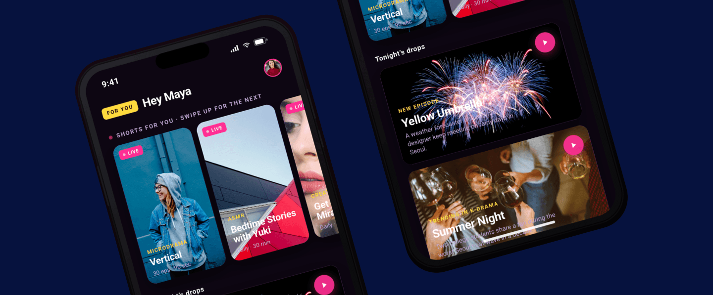
A 19-year-old creator-economy viewer on her iPhone wants a dense grid, autoplay thumbnails, a vertical shorts rail, swipe-first navigation, and content that feels like it was built inside her feed.
The 68-year-old is not an edge case. Neither are the 1.3 billion people globally living with a disability that affects their daily digital experience. These are not niche audiences. They are the audiences most platforms have actively designed around rather than for.
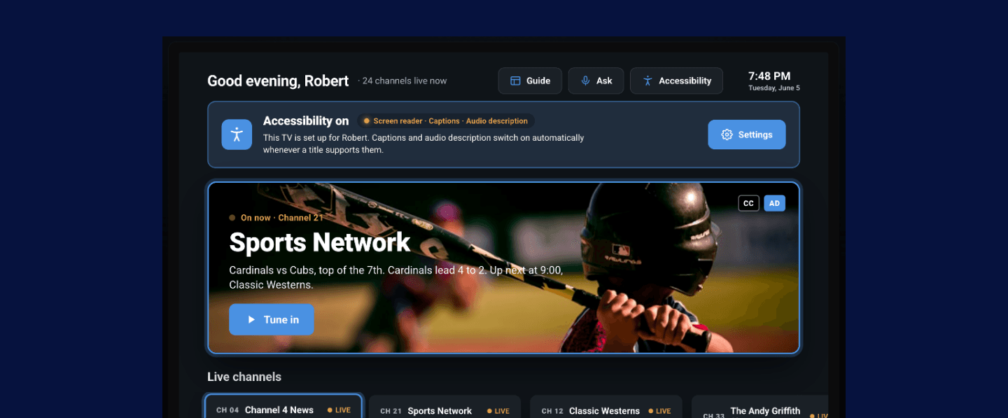
An interface that treats accessibility as a settings page buried three taps deep is not serving that audience. An interface that builds it into the profile by default, high-contrast mode, audio descriptions, reduced motion, font scaling, is not just more inclusive. It is reaching and engaging an audience that most platforms have never genuinely competed for.
The line between adaptive and unsettling
Here is the part most personalization writing avoids. There is a version of this that feels like the platform knows you, and a version that feels like it is watching you. An interface that rearranges itself with no explanation is not delightful, it is disorienting. People trust a screen they can predict and correct. So the adaptation has to be legible: the viewer should be able to see why the layout changed and pin it back when it gets them wrong. Adapting aggressively without that control does not lift engagement. It quietly erodes trust, and trust is slow to surface in a dashboard and hard to win back once it goes.
The viewers who feel the app was built for them stay longer, return more often, and resist the impulse to open a different service. McKinsey's research on AI-driven personalization puts revenue increases at 5 to 15% for companies that get this right. Deloitte's Digital Media Trends puts the engagement lift from personalized UX at up to 30%. The instinct to trust what you understand compounds over time. So does the instinct to leave what you do not.
The interface is the last mile of personalization
The platforms pulling ahead are not chasing the cleverest model. They have been honest about where the interface fails real people, and they have connected the profile through to the render layer, inside a product philosophy that keeps the viewer in control of their own experience. That means intelligence design, data engineering, and interface thinking working as a single brief. It is harder than any of them individually, and that difficulty is exactly what makes it defensible.
The monetization case is one most FAST operators have been slow to make. The viewer who wants a TV Guide layout is also the viewer most likely to engage with a linear FAST channel rail surfaced inside it. Adaptive UI is not just a retention play; it is a monetization architecture. The same profile that tells the interface to slow down, scale up, and reduce motion is the profile that tells it where to surface ad-supported content in a format that viewer will actually use.
The payoff compounds in a way that most features do not. Every session sharpens the interface. A competitor starting later cannot easily copy what your interface has already learned about your viewers. One adaptive component library serves every profile, which reduces UI maintenance cost while dramatically expanding the audience the platform can genuinely serve. Very few streamers ship this today. Moving now is a competitive position, not just an engineering project.
Adaptive UI is not a feature you ship. It is a capability you build.
At StreamTV we are getting into exactly this: what it takes to move from a one-size interface to one that adapts to the person in front of it. If that is the problem on your roadmap, come find us. StreamTV 2026. Denver. June 16–19.


